Introduction
The Logitech diNovo Edge was and in some ways still is one of the best keyboards ever build. Laser cut from a single, semi-translucent piece of black Plexiglas and set into a brushed-aluminum frame, it had back-lit icons, it was rechargeable and it even had a built-in track pad and touch sensitive volume strip. Besides being loaded with features, it was equally stunning to look at with the display stand serving as its charger. It had just one major flaw: it had backlit icons, but no back lit keys. But today we’re not focusing on the diNovo Edge, but the Logitech Wireless Illuminated Keyboard K800 which as the name implies does have backlit keys. And while the K800 lacks the fancy touchpad, high-end materials and stand, the K800 can stand upright on its own, it’s also rechargeable, has a built-in proximity sensor and even a number pad. Can the cheaper, but equally feature-loaded K800 be as good as the diNovo Edge?
Introduction
|
General Product Information: |
|
|
Cordless Protocol |
2.4 GHz eQUAD DJ (Unifying) |
|
Cordless Range |
30 Feet or 10 Meters |
|
Software Support |
SetPoint 6.51.8, Unifying Software |
|
OS Support |
Windows XP, Windows XP x64, Windows Vista, Windows Vista x64, Windows 7, Windows 8 |
|
Keyboard Specifications: |
|
|
Connection Type |
Cordless USB |
|
Connect / Power Button |
On/Off switch |
|
Battery Size and Type |
2 AA NiMh (Rechargeable) |
|
Battery Replacement |
Non-removeable |
|
Battery Life |
15 hours to 10 days, depending on backlight settings |
|
Indicator Lights (LED) |
Battery (NOTE: Goes on when battery is low.) |
|
Special Keys |
Scroll Lock, Num Lock, CAPS Lock |
|
Receiver Specifications: |
|
|
Connection Type |
USB |
|
Size |
Nano |
|
USB Type |
Full Speed, USB 2.0 |
|
USB VID_PID |
VID_046D&PID_C52B |
|
Connect |
No button |
|
Indicator Lights (LED) |
N/A |
|
Additional Hardware in Package: |
|
|
USB Desktop Stand |
Charging cable (5 Feet or 1.52 Meter cable length) |
|
Product Dimensions: |
||||
|
Product component |
Width |
Depth/Length |
Height |
Weight (No batteries) |
|
Keyboard |
487 mm (19.17 inch) |
195 mm (7.68 inch) |
27 mm (1.06 inch) |
750 g (26.46 ounce) |
|
Receiver |
14.4 mm (.57 inch) |
18.7 mm (.74 inch) |
6.1 mm (.24 inch) |
1.8 g (.06 ounce) |
The Logitech Wireless Illuminated Keyboard K800
The K800 is as expected a wireless back-lit keyboard and sits at the upper echelon of Logitech’s wireless keyboard range, right between the K750 and the newer K810. Judging by the name alone it would seem that the K810 is Logitech’s flagship wireless keyboard, but comparing the two suggests that the latter isn’t necessarily positioned higher or meant to replace the K800. In fact, when comparing the feature set of the two devices, reveals two keyboards for different uses. The K800 is a full-size keyboard (with number pad) that’s better suited for desktop use with some gaming. The K810 is a near full-sized keyboard with a number pad-lacking compact size, which seems better suited for the living room/media center or the desktop that has many mobile devices. Price wise they’re both $99.99 which suggests that one isn’t necessarily better than the other and that Logitech will continue to offer both products. Quality wise the K810’s brushed aluminum finish is closer to my beloved diNovo Edge and it’s handy switching features allows you to switch among 3 devices. The K800 does include the number pad and the included Logitech Unifying receiver means that it should work nicely with a unifying-enabled mouse using a single receiver. The K800 will work with any PC (or Smart TV) with USB port, while the K810 is Bluetooth only.
The K800 is loaded with features, firmly putting it in the premium keyboard category, but its use of mostly plastic prevents it from being categorized as a luxury keyboard which the diNovo and the K810 are. While it lacks the more exotic features like a touchpad and touch-sensitive volume strip like the diNovo, it has backlit keys which is a feature we consider to be essential in the premium category. It doesn’t stop there either, as it has an ambient light and motion sensors to automatically turn on the lights or control the brightness, it’s rechargeable and can even be used while charging. There is a number pad, which is something many still value and the keyboard also has a unique shape that allows it to stand upright, allowing you to store it standing up to free up space on your desk. The tiny Logitech Unifying receiver makes a world of difference compared to the large receiver that came with the Edge. I also like the fact that you can add other compatible devices like the Logitech Wireless Rechargeable Touchpad T650 or a Performance Mouse MX without using multiple receivers. The K810 doesn’t come with any receiver, meaning older devices without Bluetooth are better served by the K800. One feature I miss on the K800 is the touchpad. Having a number pad can be handy, but especially for Windows 8, having multi-touch touchpad would be a more useful feature. Even the $40 K400 has touchpad, making it the not-so-rare feature it once was. Logitech should consider replacing the number pad with a touch pad on their larger full-size keyboard, especially that Windows 8 is around.
Design
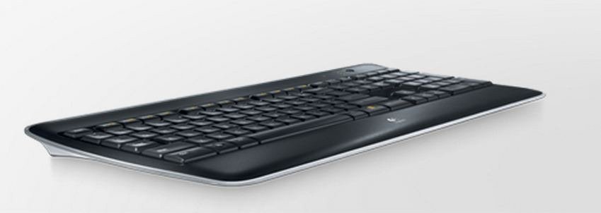
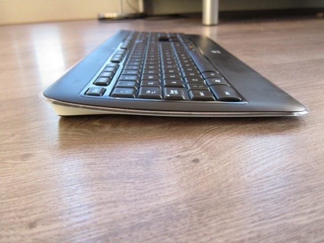
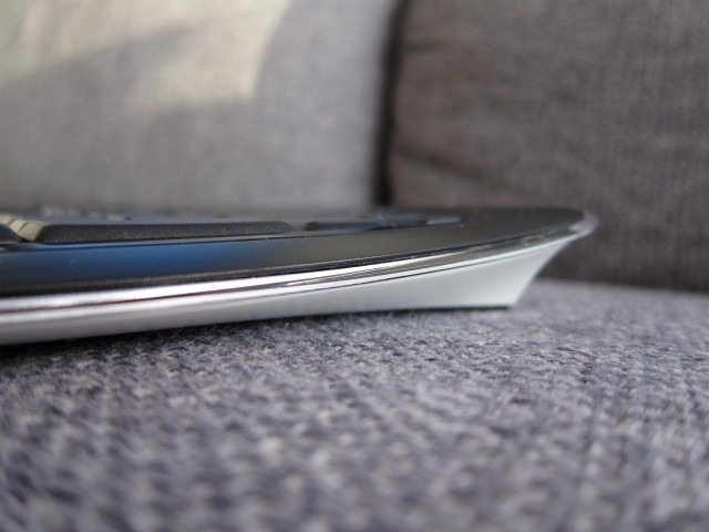
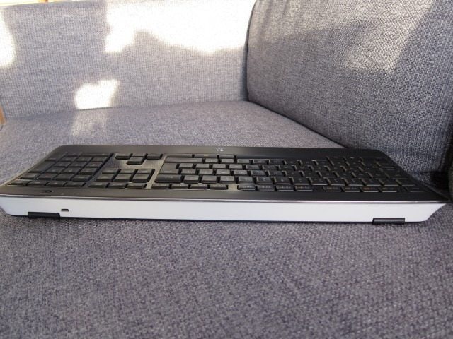
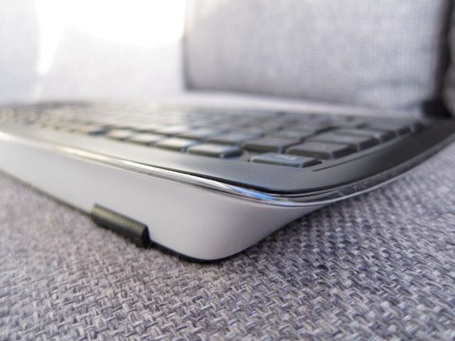
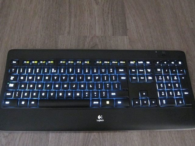
Compared to the stunning design of other Logitech keyboards like the K810, the diNovo Edge and diNovo Media Desktop, the K800 looks good, but definitely won’t be remembered if for its design. It’s without any doubt a case of function over form and it’s only when you look closer you’ll discover interesting and attractive design elements that are almost pushed back by the overall conservative all-Black design. Don’t get us wrong, the K800 looks good, in fact better than a lot of keyboards out there, but once you’ve seen the diNovo line or the K810 everything else just seems plain. The K800 has a streamlined shape with rounded edges with a mix of glossy Black near the keys and a matte Black on the wrist rest and at the top. One of those interesting design elements I was talking about is the clear edge. The entire keyboard get thinner near the edges where it ends in a stunning clear plastic edge. It’s a nice design element that adds to and frames the overall very conservative design. The entire frame of the keyboard sweeps up and curves back towards you. This way the keys placed higher up are actually pushed closer to you and easier to reach. A very smart way to cope with the large size of a keyboard as large as the K800. When seen from the side, the concave shape of the keyboard becomes even more apparent with the keys themselves staying parallel to the flat surface the keyboard is resting on. As a result, when typing your hands stay straight, instead of typing on an inclined surface, which is a good thing. It’s only the F-keys that are curved towards you, making them easier to reach.
The upper part of the keyboard has a pretty wide border, it’s even unnecessarily thick as it’s mostly clear and makes the entire frame pointlessly wide. It only houses the On/Off switch, the battery status indicator and the ambient light sensor, which a reason why we’re wondering why the border is so wide. Below the keys there’s a built-in palm rest which strikes the right balance between being wide enough to be comfortable without being too large and wide and taking too much desk space.
On the back of the keyboard there’s, you guessed it, an all-Black finish while the sides have an refreshing all-White look. You will never see the White sides unless you look at the keyboard from below or the front, because it has an anvil shape where the wider top surface completely covers the bottom and sides. This also give the keyboard an almost floating effect where it looks like you’re typing on a floating flat slab of plastic. This floating effect looks interesting and is that other design element that we love, but the overall theme is still considered conservative and all-Black. There are also three rubber feet below the palm rest, while near the top there are two retractable and adjustable legs that help increase the keyboard’s point. They can’t be retracted to the point where you are typing at an angle which ergonomically speaking isn’t the best. The best position seems to be with legs hidden in the keyboard’s frame which allows the hands to remain straight.
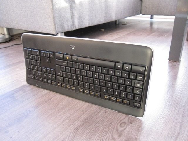
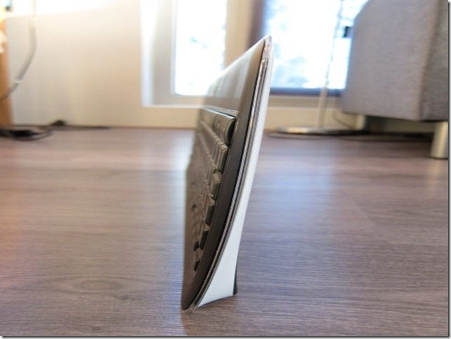
As I mentioned above, they keyboard has the ability to stand upright. This is achieved by giving the front a wide base, while it gradually gets thinner as you move toward the palm rest. This allows the entire keyboard to stand upright without falling. Well, that’s the idea. In some case pushing just a little bit against will cause it to fall as they keyboard is quite tall, but the base itself isn’t wide enough to support it.
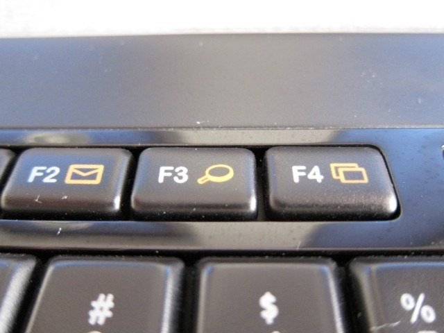
The keys use what Logitech calls “Logitech Incurve keys”, which basically means that they have a concave shape with the curve right in the middle to center your fingers when they hit a key. This also means that each key has rounded edges to help the process of moving from key to key. This way your fingers will simply glide over a smooth surface when going from key to key, instead of scratching against right angles on island style Chiclet keys. The result? Extremely comfortable typing. They keys are indeed very contoured for the shape of your fingers and actually help you find individual keys. Even when you hit the side of key, it tends, due to the shape, to automatically slide towards the center of the key. The soft edges really do make a huge difference as you slide your fingers from key to key instead of hitting pointy edges. While these “Incurve keys” make them extremely comfy to type on, they definitely do not help the keyboard when it comes to the design. I prefer the island style Chiclet-type keys with a slightly curved surface. The keys on the K800 have this bulging, bulbous shape, that make for comfortable typing, but sit too close together due to their bulbous shape. As a result they doesn’t score very high when it comes to design. The symbols on the keys a have light grey metallic finish, yet are translucent enough to let the back light to shine true. It has a nice White soft glowing light with a slightly Purple tint to it. The FN key and the enhanced function symbols on the F-keys are painted in an Orange and as expected, they too light up. Upon closer inspection it becomes clear that each key has an extra layer of clear plastic which will prevent the symbols from fading over time.
The keys also use what Logitech calls the “PerfectStroke key system.” This gives you the travel of a desktop keyboard, with the faster response and quietness of notebook keyboards. The system really works as the keys have a relatively low profile, sort of like laptop keys, but just more bulbous and rounded. In fact they look like normal keyboard keys, just ¼ of the height. Once you start typing they have almost the same comfy, satisfying and cushy travel of normal keyboards, without being too shallow like what you get with laptop keys. But what really impressed me is how quiet typing is on the K800. It’s still not as quiet as a Samsung series 9, the MacBook Air or the diNovo Media Desktop, but it’s close. This is done by using a scissor-like mechanism, that has a folding X-shape. This shape is also said to distribute the typing force, even when you hit the key near its edges, but due the concave, your fingers are automatically drawn towards the center. Because of this I couldn’t really feel the benefits of this even distribution. What I was able to see was that when you intentionally hit a key near the edge, it doesn’t move to one side, but goes straight down without moving to the side.
Overall there isn’t much to improve here, the design is functionally almost flawless with an incredibly smooth typing experience. I just wish Logitech had removed the number pad and added a much needed touch pad. The keyboard would also look a lot better with Chiclet-type keys with an Aluminum brushed finish, similar to the K800. Other than that, there’s almost nothing to criticize when it comes to the functionality of the design. Design wise, Logitech should take a look at the K810 and that touchpad and touch sensitive volume strip to the K800. It’s without any doubt a case of function over form and it’s only when you look closer you’ll discover interesting and attractive design elements that are almost pushed back by the overall conservative all-Black design. It looks good, but it definitely won’t be remembered for its design.
Daily Use & Performance
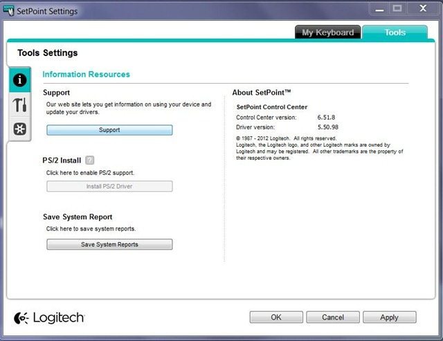
Before you start using the K800, Logitech recommends using their Setpoint software. We specifically tried version 6.51.8. We’re not really fans of installing extra software that adds icons to the notification area, adds process to the Windows startup and uses extra resources, all of which Setpoint is guilty of. In fact, the FN key and the standard secondary F-key functions work fine without installing Setpoint which is a big plus for those that like to keep their system running the bare minimum when it comes to software yet still want to get the added functions of the secondary F-key functions.
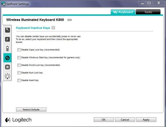
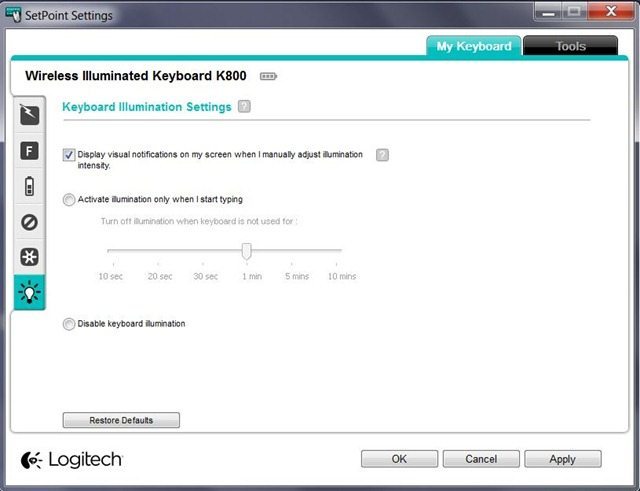
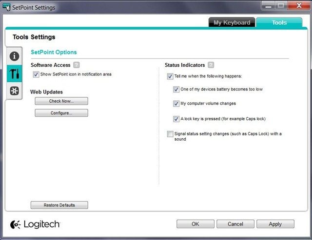
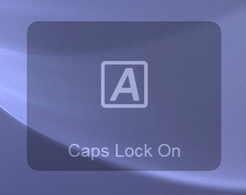
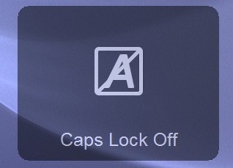
The first reason you’d want to install Setpoint is to customize the functions of the secondary enhanced F-key functions and the calculator hot key. The enhanced F-key functions are activated by pressing the FN-key with the corresponding F-key. Setpoint allows for an incredible amount of customization, allowing you to launch websites, programs, files, folders, keystroke assignments and custom menus. Even tasks like app switcher, calendar, control panel, documents, gadgets, help, next app, previous app, spreadsheets and webcam can be assigned to a specific button. The power button (F8) deserves some special attention as it doesn’t give you the customization mentioned above, but instead you can choose various options like Sleep, restart, shutdown, Log off and Lock PC. The email, search and media player enhanced function offer all the customizations above, but Setpoint also allows you to specifically choose the email or media player program and your search engine of choice. The level of customization is dizzying and for those that like to tinker with the various settings, it’s definitely worth the extra system resources that it uses. If you’re more like me and just want to stick to the basics, the default secondary F-key functions work fine, without Setpoint installed. Another reason why you’d want to use Setpoint is because it allows you disable certain keys like Caps Lock, Insert, Num Lock, Scroll Lock and the Windows Start key. Gamers for example will love the fact that you can disable the Windows Key which is ideal for gaming. The third reason to install Setpoint is that it gives you some control over the backlight: you can either disable it completely or only activate it when you start typing and turn it off after x amount of minutes of inactivity. Without Sepoint the backlight goes fully into automatic mode and basing decision on the input from the proximity and ambient light sensor. The last reason why you’d want to install the software are the onscreen notifications. This can be anything from when the battery of a device is low, but more often when you press a lock key (Caps Lock, Num Lock) or when you change the volume. The Caps Lock light isn’t very visible during the day, which why have these onscreen notification can mostly be handy. Forme some it can be annoying and can get in the way.
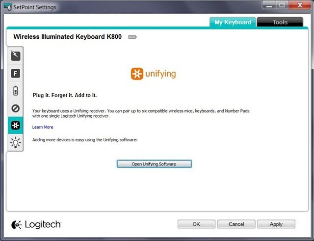
You don’t need Setpoint when you want to connect a peripheral that’s compatible with the Unifying receiver. Logitech lets you download this separately, but if you install the former it includes the Unifying software. To summarize, Setpoint has lost a lot of “weight” and uses a lot less resources than it used to in the past. It’s stable, relatively light, but still adds icons to the notification area, adds process to the Windows startup and uses extra resources, something that especially gamers won’t like. Logitech should use the formula they used with the G700 gaming mouse by allowing their keyboards to retain button customization even after Setpoint has been uninstalled through the use of built-in memory. If you do install Sepoint you’ll be treated to a dizzying amount of things to change and customize, but yet it’s quite easy to use.
The K800 came fully charged, but if you need to charge it up, it’s as easy as plugging the included USB cable to the front of the keyboard and the other hand to a USB port on your PC. It charged relatively fast and what liked is that the charging time doesn’t really matter as the keyboard can be used while charging. Logitech mentions a max battery life of about 10 days. But by making sure I turn the keyboard at night and with average use I actually got about 2.5 months of use on a single charge! Impressive stuff. You turn the keyboard by sliding the On/Off switch. All lights will briefly turn on, including the battery status indicator, but will elegantly and slowly dim if you don’t touch the keyboard. This is a more sophisticated approach to the lights than just turn them on and off. The illumination is beautiful, consistent without the light bleeding through you see on much cheaper products. The ambient light sensor is also able to dim or increase the brightness further adding another level of sophistication to the keyboard. The lights can also be manually be raised to a very high level using the F6 and F5 combination with the FN-key, but in full automatic mode it’s just right.
Typing is as I’ve mentioned before is incredibly comfortable. The keys are exceptionally quiet and the concave shape, rounded edges makes typing very enjoyable. When seen from above they keys look like your standard desktop keys. It’s only when look at the keyboard from the side you actually notice their thin profile. It’s also when you start typing, do you realize that they sound like laptop keys, being quiet fast, but not as fast as laptop keys. Initially it feels weird as you expect a louder click when typing, but you’ll quickly get used to this. When you return to a standard keyboard, you’ll without any doubt notice the louder clicks. What’s more impressive is the amount of travel this keyboard offers. They actually feel like your typing on a very thick keyboard that allows for a lot of travel, but again it’s only when looking from the side do you realize that not only are they keys not very tall, but the keyboard itself is quite thin, which normally doesn’t allow for a lot of travel. The magic comes from the X-type scissor mechanism used below the keys which allows for extra travel.
With the K800 I couldn’t help but feel like the keyboard is too wide. The large space does make for a very comfortable typing experience and a large enough wrist rest, but it’s definitely a keyboard you won’t be logging around despite its wireless abilities and thin profile.
During the months of testing, there was never an issue with disconnects even in a room with plenty of wireless device crowding the same 2.4Ghz wireless frequency. The keyboard exceeded the 10 meter wireless range, but realistically speaking who does that? It’s safe to say that you won’t be able to read on your screen, before the keyboard loses its connection. In fact I’ve noticed that the proprietary 2.4Ghz connection Logitech uses on its Unifying-enabled peripherals is has a more stable and robust connection than Bluetooth.
Conclusion
Can the cheaper, but equally feature-loaded K800 be as good as the diNovo Edge? Definitely. At half it’s price it still a feature-loaded keyboard that puts its firmly in the premium category. While it lacks the diNovo Edge’s touch pad and high quality materials, it covers the basics you’d expect from a premium keyboard like the backlit keys and adds nice extras like a proximity and ambient light sensor and the ability to be charged and stand upright. Making the K800 in many ways better than the diNovo. Sure, it lacks the premium materials and the beautiful design of the Edge or the K810, but overall there isn’t much to improve here, the design is functionally almost flawless with an incredibly smooth typing experience. The design of the keys make them functionally perfect and extremely comfortable to type on. At first you might never expect it, but the K800’s low profile keys are deceptively quiet and offer strangely a lot of travel. Call us impressed. We also love the extra clear plastic layer that should prevent the letters and symbols from fading. Aesthetically speaking, the bulbous keys take away from the overall design and Logitech should take a cue from the K810 to make them more pleasing to the eyes.
Setpoint has lost a lot of “weight” and uses a lot less resources than it used to in the past. It’s stable, relatively light, but still adds icons to the notification area, adds process to the Windows startup and uses extra resources, something that especially gamers won’t like. Logitech should use the formula they used with the G700 gaming mouse by allowing their keyboards to retain button customization even after Setpoint has been uninstalled through the use of built-in memory. If you do install Sepoint you’ll be treated to a dizzying amount of things to change and customize, but yet it’s quite easy to use.
They keyboard can be charged while being used, but that’s not something you’ll be doing very often, expect at least a month of use from a single charge. In the end, the K800 embodies what we would call the perfect functional keyboard: wireless, comfy and quality construction. Just don’t expect the looks and the materials of a luxury keyboard. 9 out of 10.
Pros
Solid Logitech construction and quality
Backlit keys with ambient light and proximity sensor.
Incredible amount of customization with Sepoint.
Secondary F-key functions work, even without Setpoint
Setpoint is a lot easier on system resources.
Keyboard can be used while charging
Extremely long battery life with a single charge
Keys have a low profile, but have more travel than a standard notebook keyboard.
Extremely quiet when typing.
Comfortable typing experience
Extra clear layer on each key to prevent the symbol from fading
Cons
The number pad just be replaced by a touch pad.
The keyboard is somewhat large and wide.
Island style Chiclet keys would have been more aesthetically pleasing
No built-in memory to remember customizations like the G900 mouse, Setpoint is necessary
Caps Lock light isn’t very visible during the day

