 If you want an exhaustively complete overview of the new operating system for mobile phones that Microsoft introduced in Barcelona this week at Mobile World Congress, I recommend you head over to Engadget’s writeup at this link.
I wasn’t there, we lack the travel budget of Engadget – or any budget at all, but I was highly curious and formed a few impressions. After all, I used to be a huge fan of Windows Smartphone Standard. Especially the interface that first appeared on the T-Mobile Shadow.
I completely agree that Microsoft did take a big step for a monolithic company and created something very new for their partner’s mobile phones. Unlike a lot of the press, I didn’t drink of the Microsoft kool-aide, but I will agree that it is visually very nice. It’s not new as it’s primarily a big brother to the Zune HD interface, but they’ve done a really good job. Although after years and years of Pocket PC almost anything would look good. It’s like the old joke about why the guy was hitting himself with a hammer. Because it felt so good when he stopped.
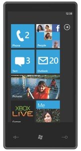
Much of the interface design (which I understand is called Metro) is based on the idea that your phone’s screen is a window into a larger view. Like Android’s home screen or Palm’s WebOS home screen. Microsoft takes it further and applies this to most of the main areas of the phone. This is where I’m not on board with the fans of this. I think that people want their information right in front of them. All the negative space in Metro is attractive but often at the expense of simply having the information you want right in front of you.
The more I see of the new Metro interface the more it reminds me of glossy fashion magazine covers. Except for the start/home screen – more on that later. There is a focus on a large title area and then subtitles…or should I say large menu titles and menu options. It really reminds me of glossy magazines. It’s not a bad metaphor, but magazines usually don’t hide large amounts of their graphics and text just off the front page.
Now, as to that start/home screen. Ergh. It’s awful. I mean, it’s really poor looking. It’s like the mole on a fashion model’s face that is added to accent their beauty. Except in this case the mole is the size of a thumb, multicolored, and has some manky looking hairs sticking out of it. I don’t care that you can arrange the tiles to suit yourself. They’re fugly and worst of all they don’t match the rest of the interface. And of course not everything is visible at once.
Oddly enough I never once saw any photos or videos of actual phone features. No basic dialing, SMS, etc. No settings screens either. This started me thinking about how designing a really great smartphone these days can often be made or lost in the details. The iPhone, even today, still lacks in some very basic areas but they were years ahead of everyone else in just getting it right. Palm/WebOS had a lot of strong history in smartphones and they did very well in the details area – and are catching up in major areas. We don’t really see these details in the demos of 7 series. It reminds me of seeing really great concept presentations. We got the big picture out of Barcelona and that was about it.
We can hope that the details are there. At some level they are there even if Microsoft goes Apple one better and doesn’t even let you at a minor level of customizing. Beyond that, we’ll see. Ultimately competition is good but that is going to also be one of the big problems Microsoft will face. Competition. iPhone is great. WebOS is possibly the slickest thing out there. Android is good, and powerful, and it’s free.
That could the Waterloo of all of them. Android is free. It’s mostly open source and getting more open all the time. The hardest road it’s facing is version fragmentation in it’s market – but it’s doing reasonably well with that already and looks to be getting better.