A device such the Samsung Galaxy S4 doesn’t need any introduction, but this review won’t just focus on the S4, but we’ll also try to find if Galaxy S III users upgrade and should those looking to get other Android devices (mainly the HTC One) also consider the S4? Let’s jump right in, but before we do, let’s have a look at the specs.
Specifications
· Display
o 5inch Full HD Super AMOLED (1920 x 1080) display, 441 ppi
· AP
o 1.9 GHz Quad-Core Processor / 1.6 GHz Octa-Core Processor
o The seletion of AP will be differed by markets
· Network
o 2.5G (GSM/ GPRS/ EDGE): 850 / 900 / 1800 / 1900 MHz
o 3G (HSPA+ 42Mbps): 850 / 900 / 1900 / 2100 MHz
o 4G (LTE Cat 3 100/50Mbps) : up to 6 different band sets (Dependent on market)
· OS
o Android 4.2.2 (Jelly bean)
· Memory
o 16 / 32 / 64GB memory + microSD slot (up to 64GB), 2GB RAM
· Camera
o Main(Rear): 13 Mega pixel Auto Focus camera with Flash & Zero Shutter Lag, BIS
o Sub (Front): 2 Mega pixel camera, Full HD recording @30fps with Zero Shutter Lag, BIS
· Camera Features
o Dual Shot , Drama Shot, Sound & Shot, 360 Photo, Animated Photo, Eraser, Night, Best Photo, Best Face, Beauty Face, HDR (High Dynamic Range), Panorama, Sports
· Video
o Codec: MPEG4, H.264, H.263, DivX, DivX3.11, VC-1, VP8, WMV7/8, Sorenson Spark, HEVC
o Recording & Playback: Full HD (1080p)
· Audio
o Codec: MP3, AMR-NB/WB, AAC/AAC+/eAAC+, WMA, OGG,
FLAC, AC-3, apt-X
· Additional Features
o Group Play: Share Music, Share Picture, Share Document,
Play Games
o Story Album, S Translator, Optical Reader
o Samsung Smart Scroll, Samsung Smart Pause, Air Gesture,
Air View
o Samsung Hub, ChatON (Voice/Video Call, Share screen,
3-way calling) Samsung WatchON
o S Travel (Trip Advisor), S Voice™ Drive, S Health
o Samsung Adapt Display, Samsung Adapt Sound, Auto adjust touch sensitivity (Glove friendly)
o Safety Assistance, Samsung Link, Screen Mirroring
o Samsung KNOX (B2B only)
· Google Mobile Services
o Google Search, Google Maps, Gmail, Google Latitude Google Play Store, Google Plus, YouTube, Google Talk, Google Places, Google Navigation, Google Downloads, Voice Search
· Sensor
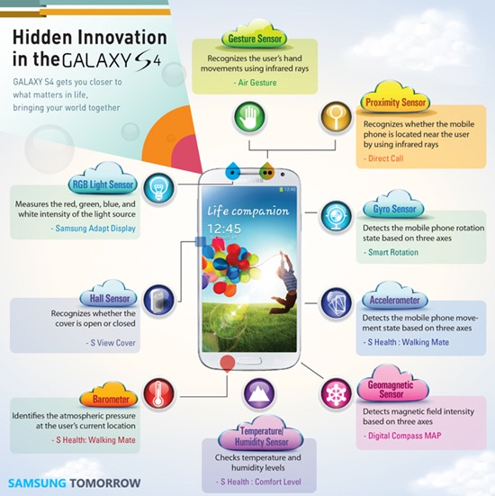
o Accelerometer, RGB light, Geomagnetic, Proximity, Gyro,
Barometer
o Temperature & Humidity, Gesture
· Dimension
o 136.6 x 69.8 x 7.9 mm, 130g
· Connectivity
o WiFi 802.11 a/b/g/n/ac (HT80)
o GPS / GLONASS
o NFC, Bluetooth® 4.0 (LE)
o IR LED (Remote Control), MHL 2.0
· Battery
o 2,600mAh
The Samsung Galaxy S4
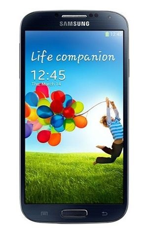
The Samsung Galaxy S4 is the latest device in the Galaxy S line and the follow up to the hugely successful S III. Worth noting is the change in name, which went from the use of Roman numerals with the “S II” and “S III” to simply “S4,” (instead of the expected “S IV.”) We can’t blame them as a single digit number is much easier to remember, recognize and as especially write.
Creating the successor to a device of that caliber is never easy. How and where do you begin with the follow up to one of the most successful smartphones ever, especially one that already did just about everything you could possibly think of? Add the fact that small changes can ruin something good, such a task might seem almost impossible. Samsung seem to have to kept that last part in mind and as result have played it safe, not taking any risks when designing the S4. While it does bring new (sometimes gimmicky) features to the table, the S4 can only be considered an evolution, a refinement if you will of the S III. Where the Galaxy S and S II where enthusiasts devices with a few rough edges, the level of refinement achieved with the S III meant that it would also appeal to the general public. And appeal it did. The S4 takes the refinement to another level with a more upscale feel, despite the all the plastic design, while the software has a combination of a more subtle and refined look in combination with even more gestures and eye-tracking. While the S III was a device that appealed to enthusiasts and the average consumer, the S4 takes it to the level where’s actually not only appealing, but it becomes an object of desire, an icon. Sort of like what Apple has done with the iPhone.
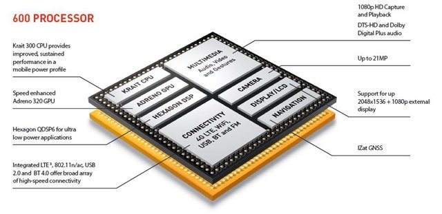
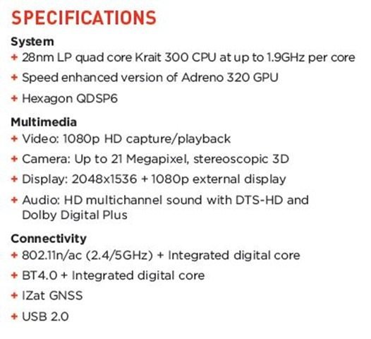
The S4 comes in two main variants: the the Exynos 5 Octa version which only supports HSPA+ and the quad-core Qualcomm Snapdragon 600 version which unlike the Exynos version is fully LTE compatible. One exception to this rule is the South-Korean-specific LTE-A version which is basically the best of both worlds and runs on the Exynos 5 in addition to the ultra-fast LTE-A support. Why do South-Koreans always get all the fun? Another twist is the Google Play Edition, which is basically the Qualcomm Snapdragon 600 version, but ditches Samsung’s own Touchwiz for stock Android. These two main variants are supposed to be available in 7 colors: Pink Twilight, Red Aurora, Purple Mirage, Brown Autumn, Blue Artic, Black Mist and Artic White Frost, but so far I’ve only come across the latter two. Samsung typically tends to add more colors after the initial two or three, which is why I believe we’ll soon start to see these other colors. But in the meantime, I really hope you like White or Black.
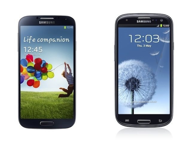
Compared to the S III, the S4’s biggest change is the larger 5” screen (compared to 4.8”) which now sports Gorilla Glass 3 and a jump in resolution from 720 to 1080. While the frame itself is a bit more svelte and less bulbous, the overall dimensions remain about the same, making it even more difficult for the untrained eye to spot the difference between the two. Look a bit closer and you’ll notice that Samsung has managed to cram in a much larger screen in the same frame, instead just of making the device larger. Something we like a lot, especially since verybody likes a bit screen, but a large device with the Note or Mega’s proportions isn’t for everyone. The camera jumps from 8 to 13 megapixels, we now have an average 2600 mAh battery, compared to the previous 2100 mAh and there’s an IR-blaster. While the jump in megapixel isn’t anything major, the jump in image quality definitely is noticeable and many of the new cameras tricks are cool. When we analyze these specs, the 2600 mAh battery sticks out a bit as the only component that isn’t class-leading. When you consider that Motorola has managed to cram in 3300mAh inside the ultra-thin Droid Razr Maxx HD you’ll start to see that this one area where Samsung is playing catchup. This is even a priority when you consider that the S4 isn’t as battery efficient as I thought. Samsung should make it a priority to make there device able to run at least 2 days on a single charge, hence a much larger battery, something north of 3000mAh is needed.
On a plus side we absolutely love the fact that we can remove the battery, a feature that is becoming increasingly rare and something we hope Samsung will never abandon (Well, at least until batteries are able to run several years on a single charge J.) This means that I can always carry a second battery and swap it when needed. Also, batteries tend to lose their ability to hold a charge after several years, in this case the battery is user-replaceable and again it’s just a matter of swapping batteries. Another feature we still love about the Galaxy line is that Samsung still insists on using external memory. While HTC and Apple have decided to abandon this feature (on their flagship devices), we applaud Samsung for the inclusion of this feature and I can’t begin to explain in words how valuable this is. This is one of the key feature that sets them apart from the rest and I don’t see why they should break this tradition. Other important hardware changes include NFC, which now uses a Broadcom NFC chip, which interestingly doesn’t support MIFARE and as result doesn’t support the first generation of their own TecTiles NFC tags and sadly FM radio has been omitted. This shouldn’t be a big problem, since most radios now broadcast online and there are plenty of stations to keep you entertained. The reduction in cost and complexity is at least is a welcome plus. Other tidbits that are worth mention and which are used in apps like the included S Health app is the inclusion of a barometer, thermometer, humidity sensor, even a geomagnetic sensor for the compass and a Hall sensor for the S view Cover. There’s also the usual accelerometer, gyroscope, With the right apps, the S4 can easily become the ultimate weather station and using several of these devices can provide insight to real-time weather conditions in cities.
Software wise, Touchwiz has grown up from the cartoony Windows XP and Fischer Price type icon, to a more refined, subdued and elegant look and icons with soft pastel colors and beautiful shades of Blue, Green, Orange and purple. As always, Touchwiz is feature packed with handy improvements over stock Android. This time Samsung has managed to put in even more features and functions, basically put, just about everything you can think of it’s there. It’s so feature-packed to the point that it sometimes becomes too much, just look at that notification panel. But the biggest newest feature are the S4’s gesture, facial and eye-track features and a new camera interface which just bombards the user with many useful and again sometimes gimmicky camera tricks. There’s also Group Play which makes gaming, music, documents and games social with nearby Galaxy users through the use of a mobile access point and S Health, a health and exercise tracker with some nifty tricks. All of which we’ll take a look at in the software section.
Design
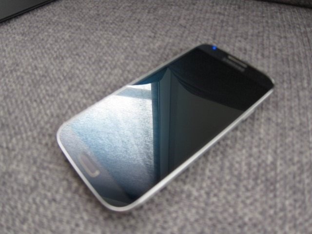
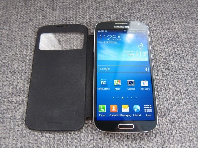
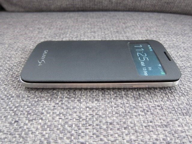
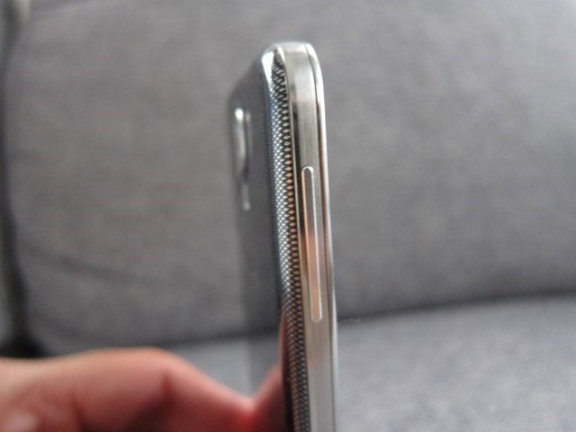
At first glance, there’s no doubt about the fact that S4 does look a lot like the S III, but look closer and you’ll find a more refined, more upscale device that’s intended to look more like a fine watch (despite being all-plastic), rather than the organic and bulbous pebble that is the S III. There’s only so much you can do with this material, but Samsung seems to have done an amazing job. The illusions of a scratched metallic rim and the perforated metal on the front is quite convincing, but with the added weight reduction of plastic. On the back the effect is less-than-perfect, but it’s still a remarkable achievement, considering it’s a thin piece of plastic that can be removed and yet tightly fits the rest of the frame all while avoiding squeaks and other plasticky sounds. Speaking of plastic, there’s been a lot of criticism surrounding Sammy’s use of this material, but my experience has been that it’s very tough, less prone to scratches and dents than devices with a full metal body such as the HTC One and iPhone 5, in fact there’s isn’t much to support the notion that it’s less durable, unless you decide to expose your device to temperatures where Polymers start to melt, which obviously is lower than metals. Overall the S4 exudes a luxury feel, dropping the organic look with better and tighter fitting panels and parts and add the fact that it’s all been done using you-know-what, you begin to see appreciate what Samsung has done here.
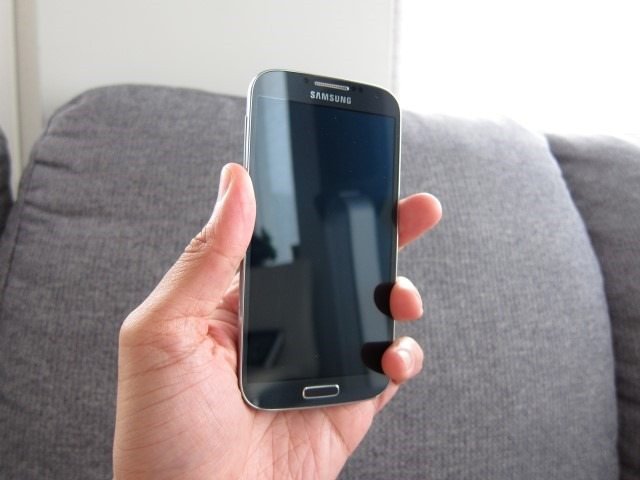
On the front we find the 5” screen surrounded by a very thin bezel. Samsung is getting close to a bezel-less design and something they should do in the next version (at least the bezel on the left and right side of the screen, you’ve do have to leave space for that Samsung logo and the home button.) The larger screen in the same frame as the S III, means that device is isn’t uncomfortably wide. As result, for a device sporting such a large screen it’s surprisingly easy to use and comfortable to hold. Below it we find Samsung’s trademark home button, which is something we love and which doubles as the application switch button. Forget those onscreen buttons of the Nexus devices, it’s nice to have a real button that doesn’t eat precious screen real-estate. To the left of it we have menu button and to the right, the back button. In my opinion, Samsung has simply gotten just right when it comes to the button layout. The combination of an actual physical button, with the back button to the right and all while leaving precious screen real-estate, they have pretty much nailed, besting even Google’s own Nexus 4, which is supposed the standard by which all Android devices are judged by. Let’s not forget the importance of that menu button: Having an actual separate button is very handy, just use a Nexus 4 or even the HTC One and you’ll see what I mean with those annoying and tiny 3 dots which typically represent the menu. Comparing Samsung’s button layout to the one found on the HTC One, you’ll immediately notice the lack of logic and messy situation on the latter device. Who puts the home button to the right? When it comes to the button layout, Samsung scores a perfect 10.
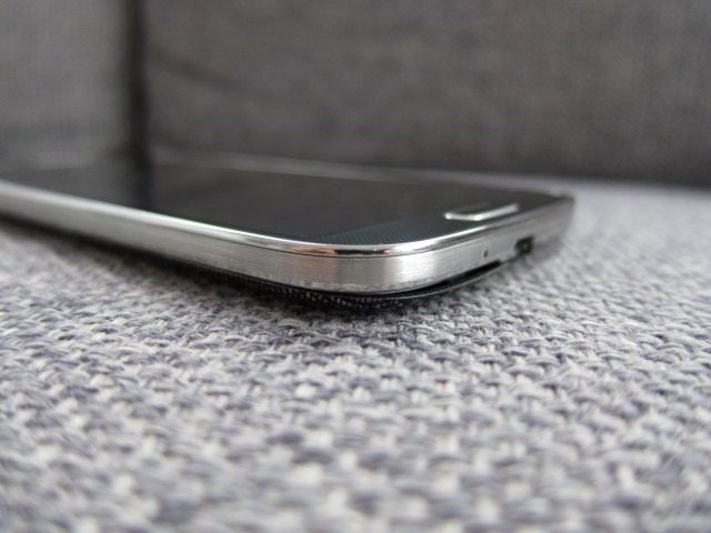
The entire front is covered by a single sheet of Gorilla Glass that simply looks great and completes the high-end look and feel of the device. The rim still is slightly raised and interrupts the smooth flow of the single sheet of glass. Samsung should make the bezel completely flat or take a look at Nokia’s Lumia 800 where the glass just curves into the body, actually adding the swiping experience. The raised rim of the S4 does mean that glass is always slightly raised when put flat on a surface, which could prevent scratching. When seen from the side, one could easily mistake this rim for real metal, but it’s not. It adds to the S4’s elegant and high-end look, but it’s only when you give it a tap and feel that it’s not cold you realize that it’s just plastic. The bezel surrounding has a faux perforated metal look that convincingly looks the part and is also responsible for the high-end look of the device. The combination of the bezel and rim are probably the best-looking implementation of Polymers designed to look like metal I’ve ever seen. All while being more scratch resistant than the actual material itself. I’m impressed by what Samsung has done here!
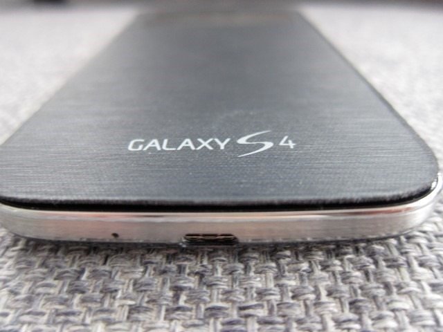
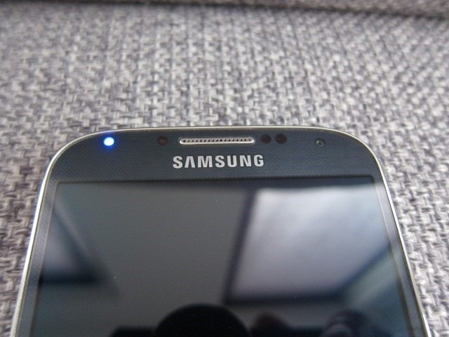
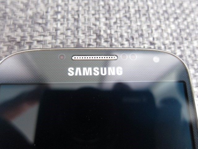
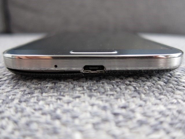
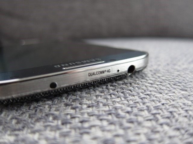
On the top of the screen there’s the usual Samsung logo, the earpiece, the 2 megapixel camera, the notification light which I’ve come to love on the Galaxy and Note line and a plethora of sensors: RGB light, gesture and proximity sensors. On the left side of the phone have a volume rocker and below the Hall sensor to detect when the S View Cover is opened and closed. On the right side of the device we find power button, which again Samsung has gotten just right. With such a large screen it’s much easier to have the power button to the right, instead of the usual top position. It’s placed not too high where it’s difficult to press and not to low where you can accidentally press it. On top we find the mic and the 3.5mm audio jack. Placement of the 3.5mm audio should ideally be on top. Having used the Galaxy Nexus with this jack located at the bottom, I can tell you that for me it simply didn’t work. On the bottom we find the other mic and the USB/MHL port. The USB is sadly is of the 2.0 kind and doesn’t support the faster USB 3.0 which is kind of what we expected. For a line of devices known for their class leading specs, there’s simply no excuse for not having USB 3.0. We’ll discuss the performance of USB 2.0 in the performance section.
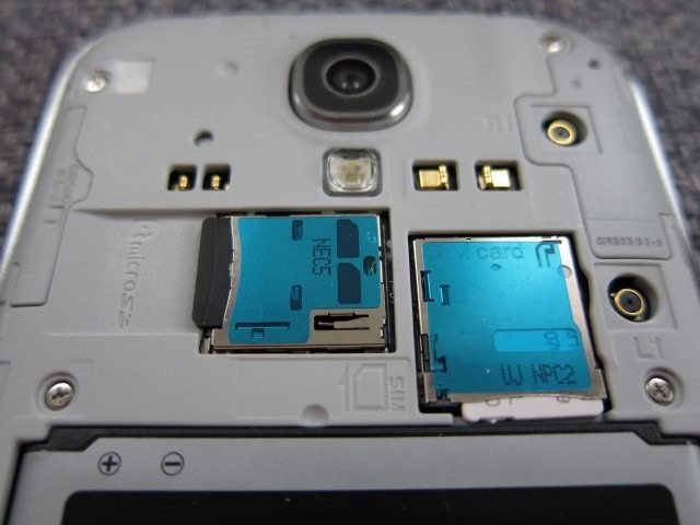
When we turn the device around we find, guess what, more plastic, but in this case that’s a good thing and the beauty of the S line: the ability to replace this cover, replace the microSD card and the battery. I can’t stress how important this feature is to me and many people I know who have Galaxy devices and is one of the reasons why many buy these devices. Having a second fully charged battery that can be swapped is simple, cheap and convenient and not being limited to the built-in memory is a major plus. Despite feeling like it’s going to break when taking the cover of, it’s very robust. Having dropped several Galaxy device, this cover never get damaged or broken, with a scratch being the most that can happen and even that was a rarity. Even so, it can easily be removed and replaced and typically go for around 15 to 20 dollars. Samsung should continue this trend and experiment with different looks like we’ve seen with the Note 3. The combination of the removable battery, the ability to use microSD cards and replaceable cover are one of the big reasons to go for an S4 instead of the HTC One. When the HTC One’s metal back is badly scratched, with the S4 it’s just a matter of replacing the fairly cheap back cover.
The lens is always exposed, but is a necessary evil when getting a device this thin. This means that over time it will probably get scratched and may start to have an effect on image quality. What we can’t understand however is why Samsung is still using an LED flash. For a device with camera camera, even better results could have been achieved with a Xenon flash and is something Samsung should seriously consider for the next device. The LED flash as it’s in its current iteration is only useable for really close shots at night. Lucky for the great camera in combination with an high ISO and long exposures are what really helps to brighten those dark scenes, basically the camera making up for the weak LED flash. If Samsung could add a Xenon flash, an LED for videos or for use as a torch and keep the current camera, this line will be a force to be reckon with.
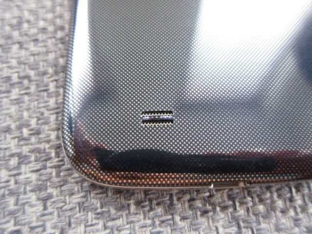
Below the flash we find the Samsung logo and below it the single speaker. Having used the 2012 edition of the Galaxy Note 10.1 and HTC One, this is another area where the S4’s speaker can be described as good but not class leading. This is one of few areas where HTC One really trumps the S4, all while also having a great design. But don’t get me wrong, the speaker isn’t bad and should be enough for most users and compared to the S III it’s a noticeable improvement that’s clearly able to dig deeper with less distortion and a higher audio output with more details. Despite all of this, we still feel like Samsung can do much better. And no, Group Play is not an option and not the same thing.
Overall, Samsung has managed to cram in an even larger and beautiful screen into a frame of about the same size as the S III. Despite the use of different Polymers, the S4 looks high-end and elegant, a very impressive feat considering it’s plastic. It’s the use of this very same material that has made these devices in my experience very tough, even more than many devices that use metals, such as the HTC One and iPhone, but that in the end tend to show scratches and get dents much easier. The major plus of the S4 and the reason why it stands above the One is the combination of the removable battery, the ability to use microSD cards and the replaceable cover. The lack of USB 3.0 means that the S4 isn’t as fast as it could have been, but USB 2.0 should be fast enough. While the camera is class leading, it’s high-end performance basically has to make up for the puny LED flash. In this area we would love to see a combination of Xenon flash and a small LED for video and torch. Samsung seems to have gotten the button placement just right, beating the HTC One and even the Google’s own Nexus 4. And finally the single speaker is a noticeable improvement over the S III, but the HTC One clearly leads when it comes to the speakers.
In part 2 of this review we’ll discuss the camera, software, performance and more!


