The S View Cover, a variant of the flip cover, is something as characteristically Samsung as oversized phones. The previous S View Cover, created for the Note 4, was released a time when the definition for the power user’s ideal phone was the Note 4. But things have changed a lot, as microSD cards and interchangeable batteries aren’t part of the equation and the very definition of what the power user’s phone should be is now a an ultra-thin phone with a curved display, no microSD, no removable battery and wireless charging. Is there still room for an S View Cover in the age of the S6 edge+ ?
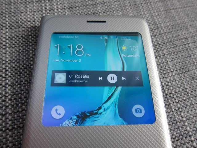
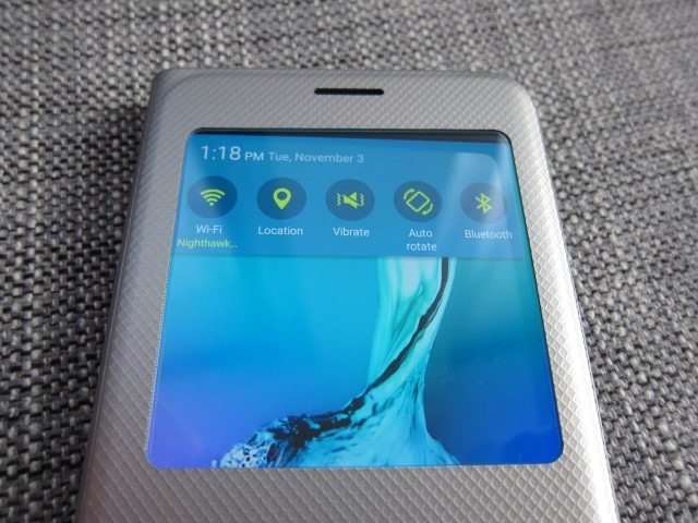
The idea behind the S View Cover for the S6 edge+ is still the same: provide basic functionality in a small window, without the need to open the flip cover.
Previous Samsung devices had a removable back cover and a result, with earlier iterations were able to remove the back cover and attach the S View Cover instead. The S6 edge+ lacks this and as a result the new S View Cover has to fasten to the device by attaching to the four corners, just like the Clear/Glossy Cover case. In fact, at its core it just an Glossy Cover case with an attached flap.
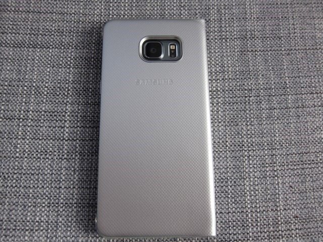
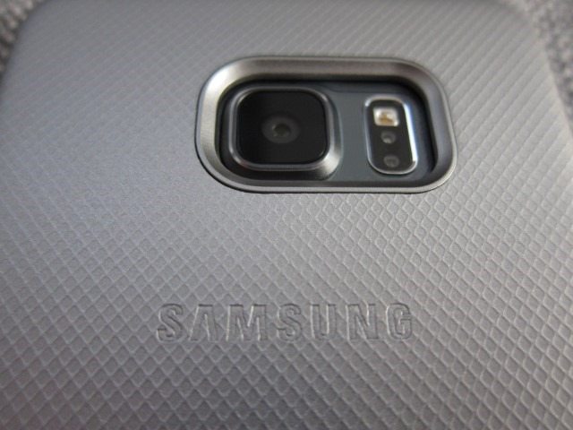
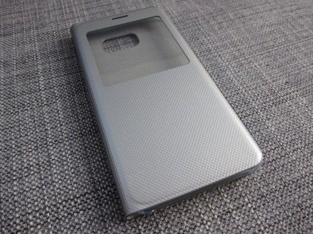
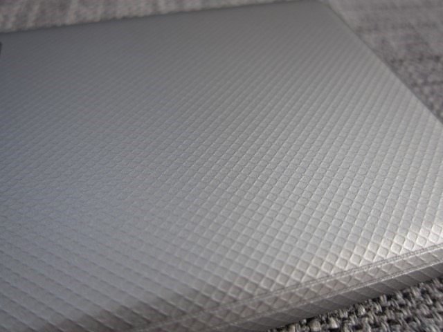
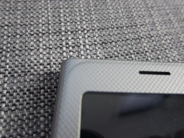
Starting from the back, it’s clear Samsung simply attached a faux metallic faux leather material with a diamond pattern that reminds me of fish scales to a Glossy Cover case. The material feels great in the hand and adds some grip. The diamond metallic finish adds a modern twist to the old bland black leather finish we’ve seen before. On the back we find the usual Samsung logo and typical for these cases is the camera module sits recessed behind the case, protecting it from the usual problems. The S6 series has a protruding camera module and this case solves this by adding some thickness.
On the left side there are etched plus and minus icons, exactly where the volume buttons are.
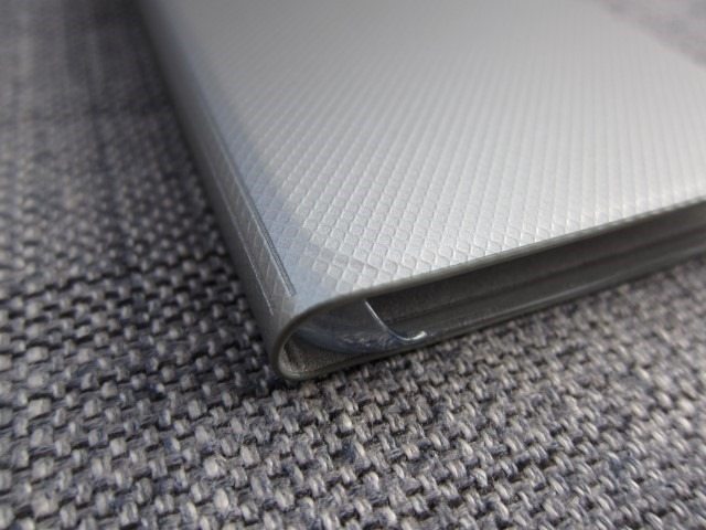
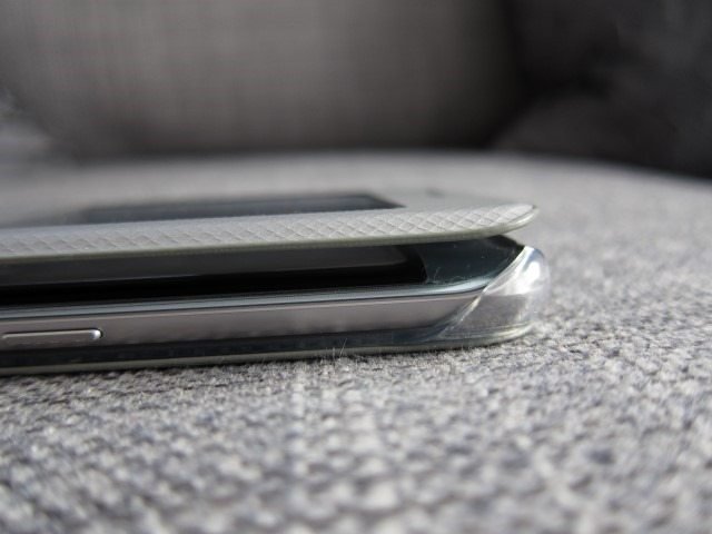
The case attaches to the phone through 4 clear attachments that also cover the four corners of the phone. Previous version protected these four corners, by creating flaps that extend beyond the edges. This solution is very effective: it’s not only a way to attach to the phone, but it also protects the four corners.
The inside of the case is lined with a soft fabric lining that should prevent scratches and it does. But there’s a catch, the plastic window is obviously not aligned with this soft fabric and with enough pressure will scratch your screen. While it has been established that the S6 version caused scratches in some cases, the same reports are trickling in from S6 edge+ users. This shouldn’t be problem if you have a screen protector, but it’s very ironic that the very case that’s supposed to protect your screen is the very same cause of the scratches. If you’re interested in this case, a screen protector is a must!
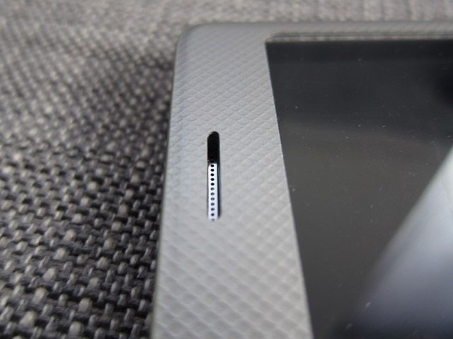
On the front we have the same material, the large S View window and a cut out for the earpiece. It also covers the handy LED notification light, which is a major oversight. Because of this you have to constantly check your phone for notification, while the LED light can be seen from across the room.
The phone uses the hall sensor to detect when the front cover is opened or closed and will either utilize the entire screen or just the small upper area for the S View window. In the end it all comes down to the phone’s own software does all the magic and heavy lifting, as the case itself isn’t “smart” in any way. There’s a specific “Accessories” section in the S6 edge+’s options that allows you to customize the cover. Interestingly, these options only appears when the S View cover is attached. There’s the option to utilize the hall and lock and unlock the screen by simply opening and closing the case. You can also set its wallpaper and what notifications can be shown. There’s also a special “Show information” section where you can choose the weather, your own text and a dual clock when roaming. Strangely missing is the ability to show the step counter, a feature that we’ve seen on both the Note 4 and S5.
Speaking of missing features, the step counter isn’t the only missing feature. The Note 4’s S View Cover also had the ability to turn on the flash and use it as a torch, favorite contacts and heart rate monitor. Luckily the favorite contacts are still there. I rarely know people that use S Health, so I can understand the removable of the heart rate sensor and step counter, but the torch is feature that should have stayed.
But what can it do? The ability to take calls and view notification are still there. Call favorite contacts? Check. Quick access to the camera is also there. Something that is new, is the ability to swipe down and have access to the entire notifications panel which gives access to things like sync, Wi-Fi and Bluetooth.
When playing music or video, you also get access to music controls. Sadly, third party players like Spotify are not supported. While Spotify is able to show its music controls on the lock screen, the phone is not able to do that on the S View cover. Samsung should add the ability to mirror controls and quick acess functions on the lock screen on the S View windows. The S View cover definitely is steps ahead of other regular flip covers, but simply put it’s not squeezing out all of its potential.
In conclusion the only difference between this and the Glossy Cover Case, is the flap and in this case the flap can cause scratches, gets in the way and has less functionality than having full access to the screen. It only protects the device if and only if it falls exactly flat on the screen and even than it’s not a guarantee. On top of that, phones mostly fall on one of the four corners and here’s where both accessories have a tie. If you are set on getting a flip case, this is the one to get and is leaps and bounds ahead of any regular flip case. But when It also comes down to design, it feels like something stuck in time when the Note 4 and S5 ruled and simply looks out of place on an S6 edge+. This case is perfect for a flat design like the regular S6, but when you buy a device with a curved display, I really think that a flip case won’t do its design any justice and you’d be better off with a back cover in combination with a screen protector. Even if you do decide to go for the S View Cover, a screen protector is a must. It gets a 6.9 out of 10.
Pros
Camera module is recessed and protected
Modern twist to traditional black leather look
Diamond pattern adds grips
Soft inner lining
Looks great
Useful features
Access to the notification panel
Uses hall sensor to lock/unlock screen
Music control
Take call
Access to favorite contacts
Cons
Plastic for the window can cause scratches, a screen protector is a must
Many features have been removed: step counter, flash light, heart rate counter.
No support for Spotify or other third party music players
Covers the notification LED.

